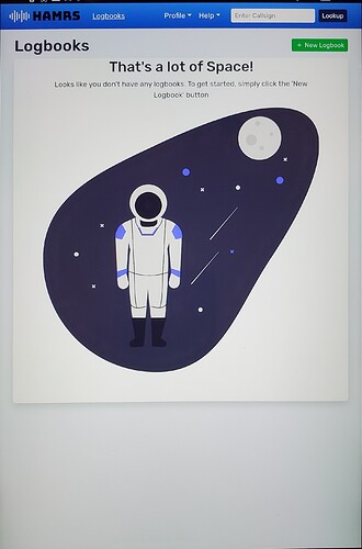
I think it might help users who may not tap on everything to see what it does like I do if, when launching the app for the first time (or anytime there is no logbook established), it presents the no log page. I love the spaceman graphic, I’d put him right front and center.
It also may be helpful to move the Logbooks button to the right alongside the Profile and Help menues on PCs and tablets, otherwise it looks like part of the logo. Or, make Logbooks a drop-down like Profiles.
If the latter option, please keep Mr Spaceman if the log is empty.  and if you do move Logbooks to the drop-down, it’ll make room on the small screen for the active profile.
Lastly, please have the app open the last log used, if one exists. If I fumble and the app closes mid-activation, or an unexpected reboot occurs, this will get me back on the air quicker.
Thank you for everything!
